It has been proven that 90% of decisions are influenced by the colour of a product. It’s true, we can be fickle consumers, making purchasing decisions based on those crucial first impressions.
At DCP we believe colour selection is one of the most important steps in the branding process. So, we thought we’d take a closer look at how colour affects consumers and the brands acing the psychology of colour.
What do we mean by the psychology of colour?
The psychology of colour refers to the science of how colour affects human behaviour. Researchers found it causes an emotional response, altering how we perceive a product.
Colour is a visual cue that helps your target market to see and feel what you want them to. It directs our eye on where to look and how to interpret this information.
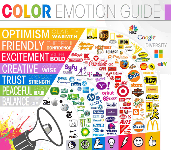
Red
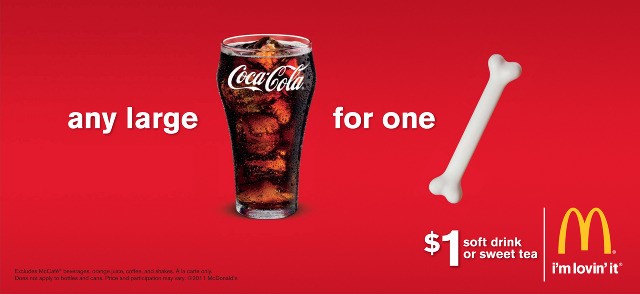
Red is unquestionably the most powerful. Coca Cola and McDonald’s are the most renowned companies that adopt red in their branding to create a sense of excitement and positivity. In marketing red increases individual pulse rates, making it the ideal colour to target impulsive shoppers.
Yellow
Yellow; the colour of optimism and cheer. It’s the best choice for brands looking to immediately grab consumer attention, as it attracts the eye the quickest. Too much yellow, however, has been found to cause anxiety, so the colour should be used in moderation.
Orange
Orange is a great combination of red and yellow, bringing optimism and enthusiasm. Again, in marketing, it targets impulsive shoppers and creates a striking call to action.
Blue

Blue creates a sense of calmness and serenity. When used by brands blue provides us with a feeling of confidence and trust. It’s no surprise that the big 3 social media platforms use the colour across their branding. Blue may be perfect for your business if you pride yourself on professionalism and strength.
Purple
Purple throughout time has always been associated with royalty and luxury. It exudes opulence and lavishness. Many brands use its connotations in the psychology of colour to create the illusion of an experience through their branding. Purple carries with it a sense of innovation, making it the most popular colour choice in the creative industry.
Green
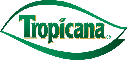
Green exudes health and tranquillity and represents new growth. Many health focused food brands like Tropicana uses the psychology behind the colour to portray its brand philosophy. With Tropicana green tones help to communicate its natural pure ingredients. Green would be the ideal colour for natural, eco-friendly products.
Black and White
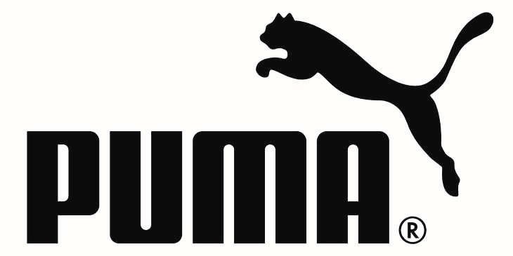
Black and White are for those of us who love simplicity. Although black and white aren’t technically colours, they have created some of the best brand logos that currently exist in the market. When used together these colours represent authority and boldness, creating a sterile feeling. The colour combination tends to draw attention in a subtle way, making for a timeless, simplistic branding approach. Sportswear brands like Puma, Nike and Adidas take advantage of the two colours’ psychological effects to create the perfect branding balance.
As a creative agency, we understand the psychology of colour and how it impacts your branding. In truth, colour connotations are largely generalised and can often depend on personal experiences and cultural differences. Colour selection shouldn’t solely rely on the principles discussed above, it should support your brand identity and personality.
Ultimately, your branding will make or break your product and colour should be used as a supporting tool to help you decide what represents your brand values. For more information on how Digital Creative Packaging can help with your branding design, contact our team today. You’ll be happy you did.