With a new year comes new possibilities. If you’re thinking of mixing things up in 2018, you came to the right place. We’re all about pushing the boundaries of design to make your packaging shine on the shelf. So, what better way to get inspired than discovering our pick of the top packaging design trends 2018.
Simplicity is King
Taking notes from our 2017 trend ‘less is more’, Simplicity still reigns in 2018. With so much noise and messaging, brands are revelling in the joys of contrast. Clean fonts, minimalist colours, utilitarian design and clean labels will all remain on designer’s radar. Our top tips for brands looking to achieve a minimalist look? Focus on your product USPs, core messages and try to use symbols where you can. Be wary of overdoing this trend, if consumers can’t decipher what’s inside the packaging chances are they’ll completely miss the concept.
#Spotted: Supplements, Protein Powders, Healthy Snacks, Tea, Coffee, Beauty & Cosmetics, Fashion, Technology


Authentic
There is a still an important place in packaging for an authentic design that takes cues from years gone by. Authenticity can massively increase consumer trust, with designers taking inspiration from bygone eras that create certain emotional triggers and feelings of nostalgia. This trend is a must for established brands to capitalise on their heritage, especially as they come under fire from competitive discounting and new category disrupters.
#Spotted: Spirits, Wine, Toiletries, Beauty, Food


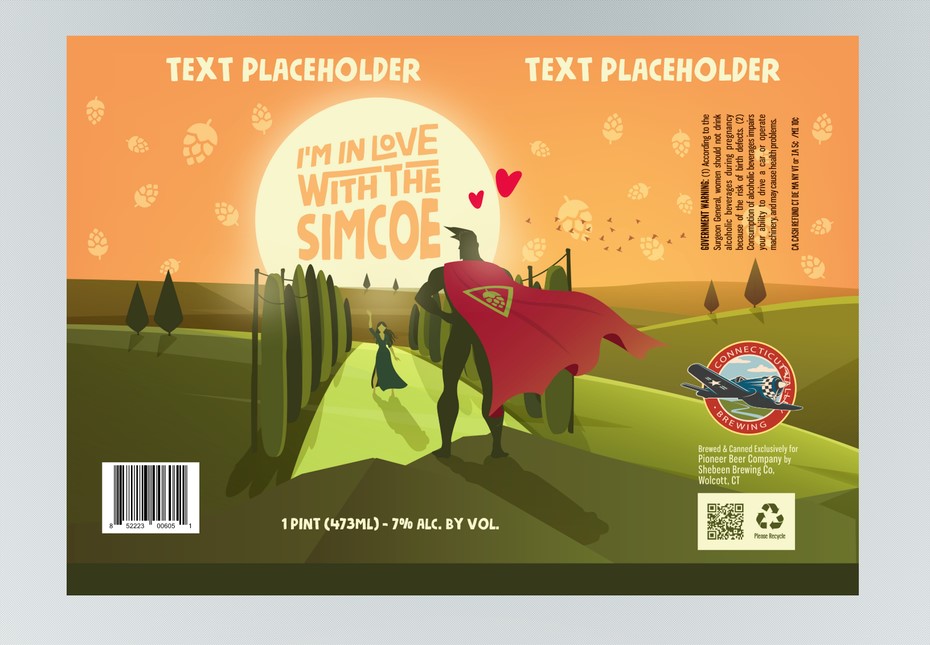
Back to The Movies
Ever picked up something and feel like you’ve seen it before? That’s exactly what the movie trend intends to do. Taking you back to those epic retro posters adorned on your bedroom walls, evoking positive feelings and warm memories through association. This trend stands to make your product a true blockbuster.
#Spotted: Craft Beer, Food, Games, Sauces, Snacks

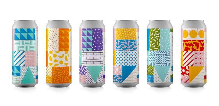
Colour Pop Geo-Graphics
Abstract graphic design and mixed media are still making waves across packaging, with bold and colourful combinations sure to stand out on the shelf. This trend is especially prevalent in drinks branding as the colour pop perfectly represents the refreshing content within. Nutella also rocked the foodie world with their launch of pack designed completely by Ai algorithms, leaving graphic designers quaking in their boots.
#Spotted: Drinks, Beer, Wine, Food, Snacks, Sweets


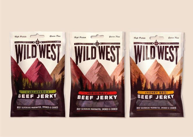
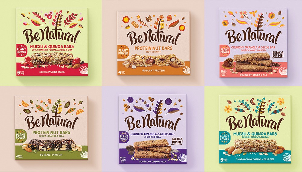
Back to Nature
There’s nothing like using the elements to create a sense of natural and organic produce. 2018 brings a deeper connection with nature and design, especially in food and drink. Designers look to capture the origin and essence of a product with graphics showcasing landscapes, horticulture and key ingredients whimsically strewn across the pack. Here at DCP, we love any excuse to unleash our inner Attenborough.
Spotted: Drinks, Tea, Beer, Juices, Spirits, Healthy Snacks, Cereals


Doodling About
There is no better way to communicate a fun-loving, creative and energetic brand than with great illustrative doodles. They immediately grab the attention of younger Millennial and Generation Z shoppers and tap into our feelings of youth and nostalgia. Some of the biggest consumer brands of 2017 captured this trend beautifully, from craft beer to pet foods, soft drinks to noodles. If you’re a young, forward-thinking brand planning to disrupt a competitive market then this trend is for you.
#Spotted: Craft Beer, Fruit Drinks, Convenience Foods, World Foods


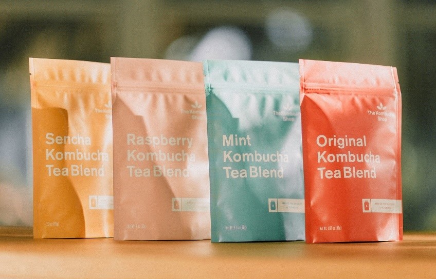
Say it Loud
Similar to the guiding principles of the simplicity trend, using large fonts and bold typography gets straight to the point. This no BS approach to packaging design has seen brands flourish, especially in more health-focused market sectors where brand transparency is key. Contrasting colours, mixed with simple fonts make it easy to decipher contents, features and benefits immediately.
#Spotted: Supplements, Protein Powders, Drinks, Spirits, Beauty & Cosmetics


Hopefully, we’ve given you some food for thought! When it comes to product packaging trends may come and go, but true market research and a real understanding of your consumer should always be at the heart of your packaging design strategy, be it 2018 or 2050.
2 Comments.
[…] literally) with the Pantone Colour of The Year, Ultraviolet. And we’ve offered a snapshot of the key design trends set to feature in packaging this year. But truth be told, trends come and […]
[…] These lively designs are reminiscent of summer with bright pastel colourways and natural elements, helping to communicate the organic ingredients used in the product. Natural design cues in packaging have featured significantly in new product launches this year. You can read more about Packaging Design Trends for 2018 over on our blog here. […]